Aurich Lawson | Getty Images | Wikipedia
Dark mode, night mode, light-on-dark design, or whatever you want to call the version of computer content that doesn’t look blindingly bright at night, had a bit of a spike around 2019-2020. That’s when Android and iOS came up with a system-wide way to implement a darker theme and signal compatible apps to do the same. A whole bunch of systems, apps, websites, and other digital tools quickly followed.
Except for Wikipedia, which is particularly notable. Despite being one of the most nighttime-wandering-friendly sites, Wikipedia had no official way to transform its iconic white pages into something more sleep- and eye-friendly. Now, thanks to the hard work of its community, a dark mode (technically a dark “Color” setting) is available to most Wikipedia visitors, both on desktop and mobile.
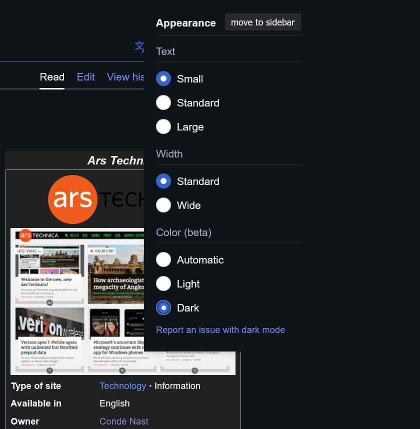
On a desktop, look for a sidebar on the right side that has buttons to set text size and width, then “Color (beta).” If you don’t see a sidebar, look for a glasses icon in the upper-right corner near the search and account tools. On a mobile device, look for the three horizontal bars (also called a hamburger button) in the upper-left corner of a page, choose Settings, then choose your color. There’s the standard Light you’re familiar with, Dark, and Automatic, which takes its color cues from your system.

Dark mode is in beta, although it looks pretty decent on most user-facing pages.
Wikipedia
Over a year ago, dark mode was the most requested feature in Wikipedia’s 2023 Community Wishlist survey. It may seem like a simple matter to invert the colors of a primarily text-based website. But as noted in a 2023 survey discussion on Reddit, it’s never that simple. Many of Wikipedia’s inline styles have hard-coded colors. Browser extensions that make Wikipedia dark tend to contain a lot of manual overrides for these colors. As Redditor gwern put it:
This is really one of those things that you can get 95% done by just adding 1 line of CSS like
body{filter: invert(100%);}but then, to reach 99% correctness and eliminate all annoying bugs, you have to completely rewrite your site design, and reaching 100% is impossible.
Phabricator, Wikipedia’s bug and issue tracker, shows a ticket “Provide a dark/night mode theme or skin” from June 22, 2010. Things really start to pick up steam in early 2022, and the discussion spans a wide range of topics, including accessibility, machine learning, and color-coded map keys. The overall task was marked as “Solved” on July 12, though many subtasks remain to be resolved.


